
Designed to Exhale
The Colours That Make a Meditation Space Breathe
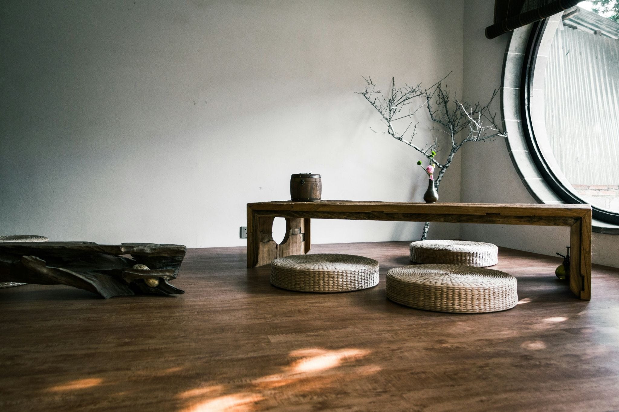
Colour is one of the most powerful tools we have for shaping how we feel in a space. It influences our mood, our energy, and our ability to slow down.
Colour isn’t just a visual choice, it’s a psychological one. The hues we surround either support or work against the kind of deep rest we’re looking for. When it comes to creating a meditation space, understanding colour psychology is everything. It’s the foundation.
Why Colour Affects the Way You Feel
Meditation helps us regulate our emotions consciously. Colour does the same thing, but unconsciously. Our brains are wired to respond to colour through our deep connection to the natural world, and those responses are remarkably consistent across people and cultures.
Think about it this way: warm colours, reds, oranges, and yellows, are energising. They’re connected to our instinctual drive, hunger, excitement, and social stimulation. Cool colours, blues and greens, do the opposite. They evoke clear summer skies and lush forests, naturally reducing heart rate, lowering stress, and promoting a sense of calm. It’s no coincidence that hospitals and clinics have long favoured these tones.
